Codes &
Conventions serves as an indicator of a genre and helps film viewers to
identify media content, it aids many in identifying certain genres of film e.g.
Horror. However over time certain demographics of genre
require more unique elements within their films and as a result the
codes and conventions of a genre are altered & subverted further creating a
sub-genre or sub category; the Slasher genre is an example of a sub-genre,
blending gore, mystery, violence and thriller elements to entertain its
audiences whilst still maintaining and abiding by the formulaic qualities of a
Horror film for easy identification. By subverting traditional elements of a
genre and yet abiding by the key factors that characterise the genre, a film
can be new fresh and exciting whilst still catering to the genre’s roots, this
pleases both older, more traditional genre fans and the newer, more modern
genre fans. I believe this is the approach ‘The Return’ has made via the three
main ancillary tasks of the poster, magazine and trailer. This evaluation essay
is split into three segments regarding those ancillary tasks for ease of
reading.
Trailer
Firstly
Slasher films follow a set of generic and formulaic conventions which are
ubiquitous among almost all Slasher titles (excluding Scream which was almost a
satire of the genre’s characterising values). The conventions goes as follows
(refer to History of Slasher Genre and Conventions Slideshow for more detail);
A final girl, who is innocent and virginal along with a group of generic,
promiscuous and ‘morally questionable’ teens are tormented by a psychopathic
sadistic killer who is conventionally a male, is masked and working single
handily, and systematically ‘picks off’ each member of the group with those who
were promiscuous getting killed first. The final girl is the sole surviving
member of the group due to her virginal qualities with again a wider meaning
being displayed of Virginity Vs Promiscuous, examples of this narrative
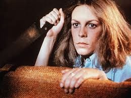
plotline are prominent and epitomised in Halloween and Friday The 13th


‘The Return’
abides by the most common and formulaic qualities of the genre whilst subtly
twisting and subverting certain elements such as; the character of Frankie who,
on the surface has a facade of being innocent just as the viewer would expect
of a final girl. However as the narrative unfolds the viewer discovers she is
not so innocent as she appears as she is the catalyst for Ruby returning as the
film title implies. She abused Ruby when she was in need of an older sibling,
but Frankie defeated the role of a loving older sister by abandoning and
neglecting her to the extent where Ruby was forced to leave due to her
unbearable pain she was suffering in the hands of Frankie, this torment
inflicted by Frankie was a result of her selfish personality as she required
attention from her parents which was diverted to Ruby upon her arrival into the
family; This subverts the convention of having a totally innocent Final Girl
and yet ‘The Return’ abides by the convention of virginity by maintaining the
final girls virginity throughout the film, by doing this the film beings to cater
to traditional and modern slasher fans and makes the genre slightly more
realistic as the Final Girl Frankie is human after all, she displays
dislikeable but very human flaws which provides the audience with a focal point
of being able to relate with the character to make a more engaging viewing
experience where the viewer is rooting for her survival as she represents them
within the digesis/verisimilitude.


Also ‘The
Return’ twists the convention of a male killer by having Ruby, a female, as the
killer and abides by the theory of Barbara Creed’s ‘Women as Monstrous’; This
sees women as monstrous due to the threat of castration induced and developed
during Freudian child development between the pre- oedipal space (Where child
is attached to Mother deeply) and symbolic order (The realistic interpretation
of the world as we know it), the child views the mother as dissimilar due to
lack of male genitals and then perceives her as a threat to his manhood
(castration), this is reflected by Ruby wielding a knife which can be seen as a
phallic object by viewers in conjunction with the theory and can see it
representing the threat of castration. This also reflects the socio-historic
context in which ‘The Return’ was produced in, as Ruby, in an almost absurd
way, empowers Women due to her sheer raw power she possesses and dominance over
the other male characters e.g. Jay in which she sadistically ‘plays’ or ‘toys’
with him before killing him, this reflects the socio-historic context as even
today Women are still fighting for equal rights globally from the US for equal
pay to Saudi Arabia for Women’s rights to drive.


However
again ‘The Return’ does not completely deform the conventional aspects of a
Villain, otherwise it would not be catering to the optimal size demographic of
both traditional and newer modern fans; The killer, Ruby is masked much like
many other Villains which are masked within slasher films such as Leather face
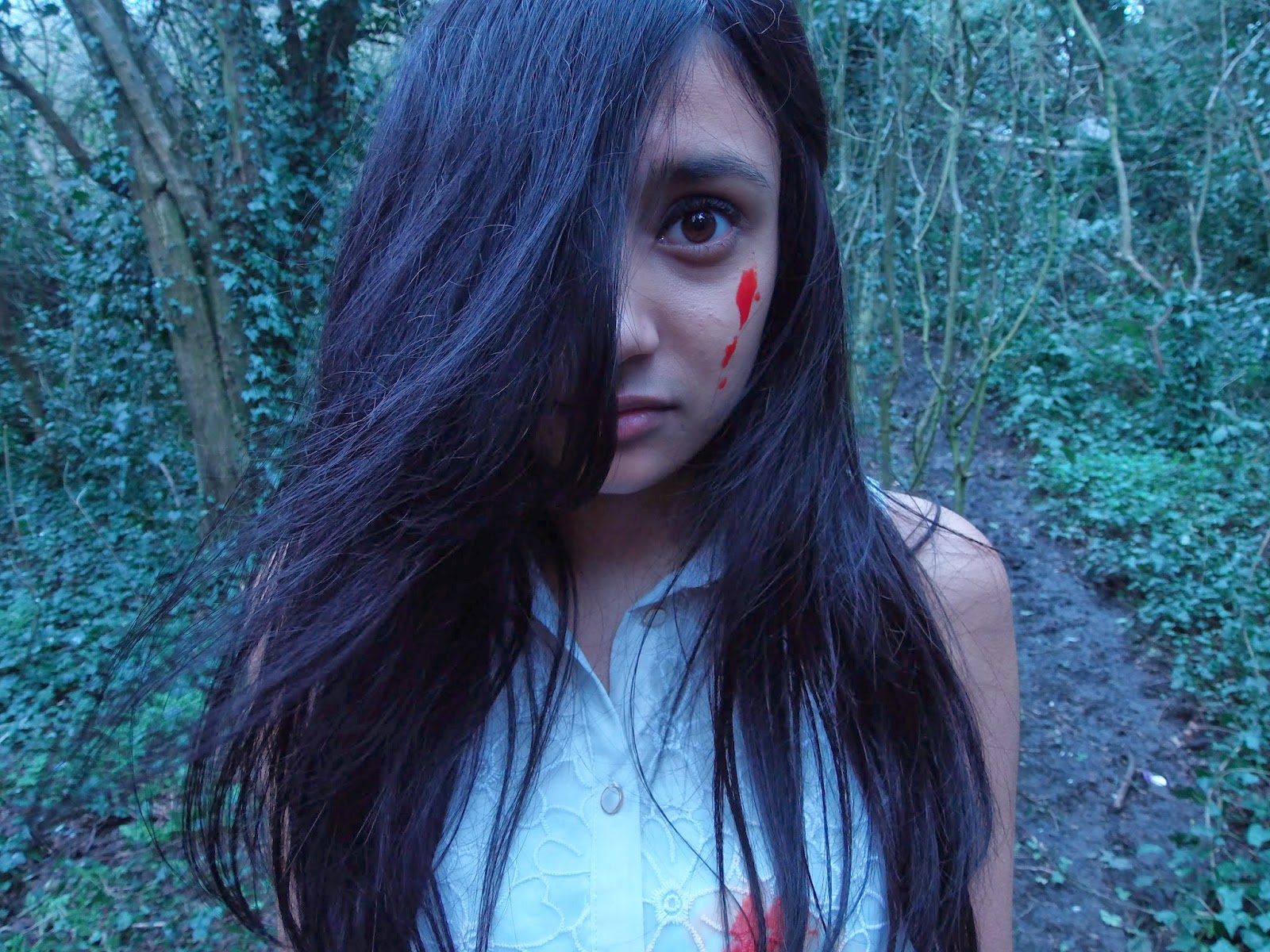
or Jason from Texas Chainsaw Massacre and Friday The 13th, Ruby utilises her hair to cover her face and
acts as a natural mask which reinforces the eerie natural quality of her being
Death personified, similar to Freddy Krueger she is masked partially with
occasional glimpse of her face underneath which represents her dehumanised
nature. Also the decision to have a female killer with her hair acting as a
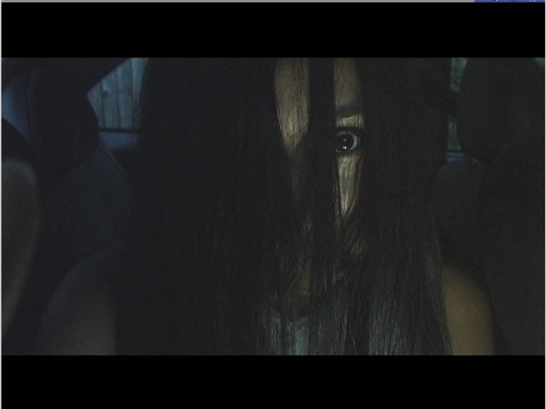
mask is a direct intertexual reference to The Grudge and a more popular slasher
title; The Ring, ‘The Return’ follows the conventions of those films by making
Ruby having reminiscent aesthetic qualities to Kayako Saeki the killer in the
Grudge and the replicated Samara Morgan in The Ring, this intertextual
reference is gratifying for the demographic to identify and caters to their
wants and needs along with the feeling of belonging or being part of ‘a group’,
as outlined in Maslow’s Hierarchy of Needs. In addition it also ‘trades’ on the audience’s knowledge of that film. 'The Return'
uses the successful ‘signs’ created in that film in order to instil a similar
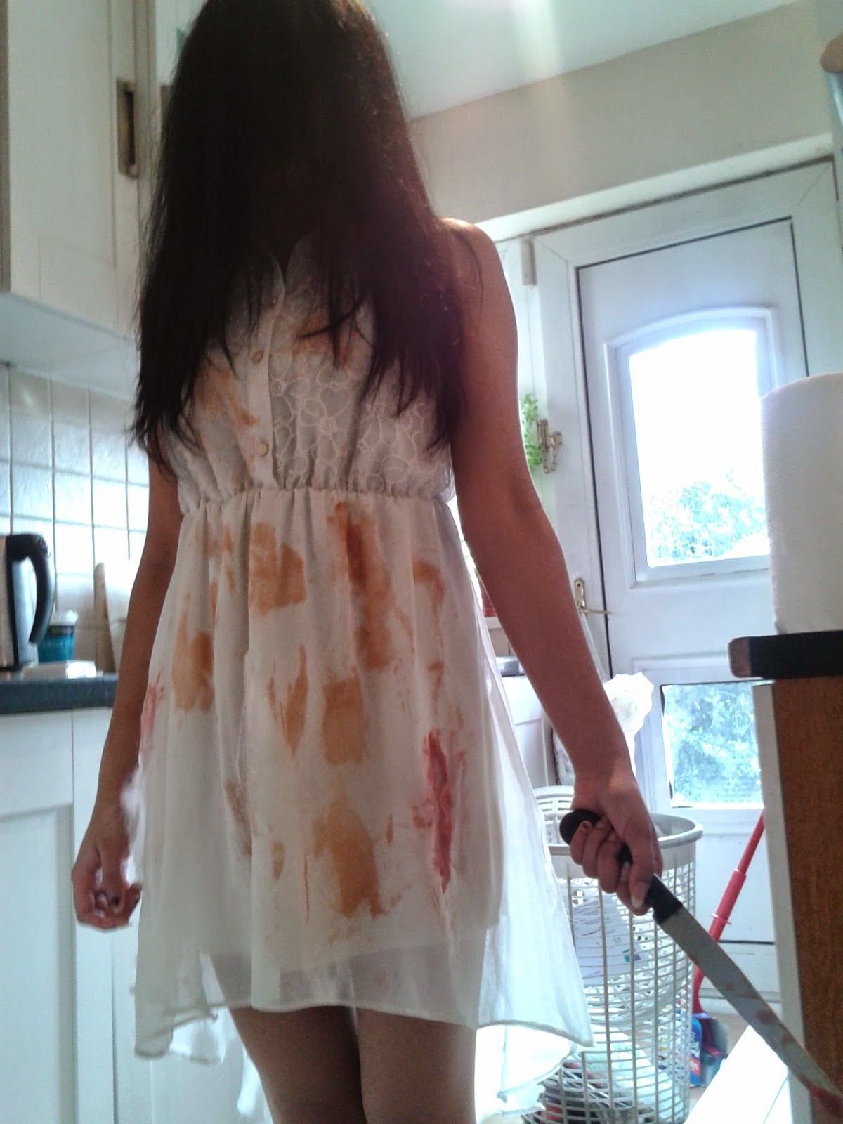
level of fear in yours, which is semiotics/iconography as the signs (Ruby or a
girl in a white dress with long hair) has now gained a fixed meaning within my
film but within the demographic too.


‘The Return’
also abided by the convention in Slasher films of having certain characters die
first such as the sexually promiscuous and the ethnic minority group member.
Chelsea in ‘The Return’ served as the sexually promiscuous character who
indulged in sex with Trey (Harry) who also fulfilled the sexually promiscuous
role but also is a member of the group of an ethnic minority which places him
in more likelihood of getting killed by Ruby, this convention which ‘The
Return’ has followed can be understood via the Marxist view that the few who
have power (white, middle class men) have therefore control over the content
released which the convention is unfortunately a result of, institutional
racism, this however is being superseded with the convention of both white and
black characters dying simultaneously and not separately however this
convention as shown in Texas Chainsaw Massacre (2013) is fairly new and
un-established hence why ‘The Return’ did not follow it, as the demographic
would not identify it.

![]()


The abiding
to the conventions results in the formulaic wider meaning being expressed by
‘The Return’ in that one must be a virgin and not promiscuous and is most
always evident and prominent in majority of existing Slasher films, the Return
therefore follows the conventional functional reading
of the Slasher genre. By following these conventions, both slasher fans,
old and new will immediately be able to recognise & identify ‘The Return’
as a Slasher film as the qualities of the genre have not been altered with in
excess, only to the point of making a film with exciting subtle twists made on
expected, common and formulaic conventions. By maintaining the characterising
conventions, the film gains recognition which is fundamental to ‘The Return’s
success, this is due to its independent production studio having a low budget
for marketing and thus less of a opportunity to promote ‘The Return’ however by
incorporating the elements above, a compromise can be made as the film is now
identifiable for Slasher fans gaining much needed recognition.
Other than
the narrative, The Return also followed many formulaic qualities to be expected
of a typical film trailer such as the
decision to display the production, distribution and associated companies
(Grizzly Productions, Splice Film & Film 4) stringed together subsequently
at the outset of the trailer, with a shot or scene being placed in between each
fade in with the next company logo being displayed.
This can be seen in many existing trailers as
identified in the Existing Trailer research such as Texas Chainsaw Massacre (2013). ‘The Return’
also followed the convention to have no recognisable qualities of a Slasher
genre product at the start of the trailer as done in Dead Man’s Shoes trailer;
this was done by having a calm almost inaudible soundtrack playing in the
outset juxtaposed with a girl in a white dress playing on a swing, this
description gives no reference to the genre within the outset yet displays some
elements of horror through its eerie qualities and the semiotics and
iconography entailed with Ruby's aesthetic appearance
however, as the trailer progresses the OST (Original Soundtrack) changes
and the tone and pace of the trailer is vastly boosted by having shorter shot
maintenance time or time the shot is sustained for aka the speed of the edit being
faster and jump cuts with more referential
content of the genre being displayed (car crash which Jason and Alex die in and
the shot of the crow flying away with the Mise En Scene displaying imminent or
approaching danger).
This was
followed in our trailer with again even more formal and formulaic conventions
such as the display of captions in between trailer scenes providing visual
relief from the trailer via intervals in which they were displayed in but also
informing the audience of the enigma code and the general narrative which can
incite interest into the film; which is effectively the sole purpose of ‘The
Return’ trailer.
Within
Slasher trailers the narrative structure is referenced to and sometimes
displayed fully for example Pam Cook’s Theory of
Classic Hollywood Institutional Narrative is not conventionally utilised or fully
explained in trailers as it defeats the purpose of having a trailer due
to major spoilers if “the overall trajectory of cause and effect leading to
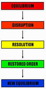
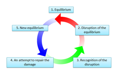
enigma resolution” was displayed in the trailer. Henceforth Todorov’s theory of
Narrative Equilibriums are displayed and referenced to formally within trailers
due to suitability of the trailer’s nature; using the theory to promote the
trailer and market or tease key events via the equilibrium stages shown, with
the new equilibrium which is the culmination of the narrative with the enigma
resolution solved (In The Return the new equilibrium is Frankie's history
unravelled, her friends dead and Ruby defeated) not being given screen time
otherwise again it would defeat the purpose of a trailer. ‘The Return’ follows
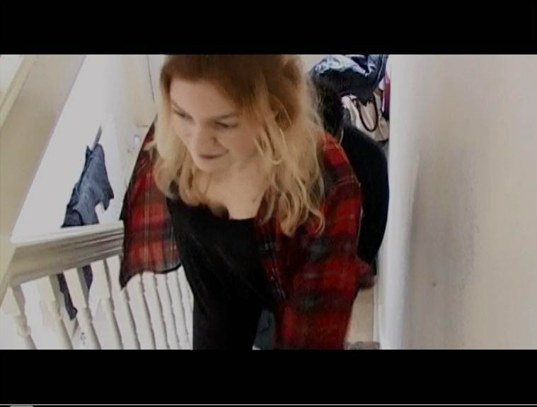
these conventions with the disruption (the party scene and the subsequent car
crash of Jason and Alex) of the equilibrium being the displayed. This then
progresses to Frankie and Amy realising the scale and consequence of their
actions by making Ruby return which is the recognition of the disruption, which
is then superseded by fast shots or scenes of the efforts to try and restore
the equilibrium where most of the drama and main narrative events are generated
from (e.g. Texas Chainsaw Massacre in which the final girl and her friends are
shown in the trailer trying to evade and yet defeat Leatherface in an attempt
to restore the equilibrium, the natural environment the film started within the
outset), this attempted restoration of equilibrium in the Return however was
only shown again through fast paced shots to give the audience a taste of The
Return fulfilling the sole purpose of the trailer; to generate
to attract an audience for the film. Had my group and myself decided not
to follow the convention of using Todorov’s theory of equilibriums in the
trailer, the trailer would become something bland and uninteresting which
demonstrates the importance of following this formal aspect of trailers. By
demonstrating these key events via the equilibrium demonstration in the trailer
the audience get more of a gist of the narrative context of ‘The Return’ such
as elements of British Social Realism, portrayal of social issues such as
teenage recklessness etc.


Usage of
other Narrative theories which are conventional in trailers are also used in
‘The Return’ such as the utilisation of semantic coding (Roland Barthes) from
both Frankie and Ruby’s perspective. Frankie’s semantic coding was carried out
through ‘Over the Shoulder’ shots which engages the viewer and helps them to
identify, relate and root for her survival. Ruby’s semantic coding was very
brief but extremely effective as found in most formulaic slasher films as there
is a convention to make the audience feel uncomfortable via subjective shots
such as Point of View or OTS shots of the villain whilst killing or spying on a
victim, this places the viewer in a helpless position because cannot stop the slaughter
from occurring and yet are experiencing the event as if they themselves are
responsible which one could call sadistic and
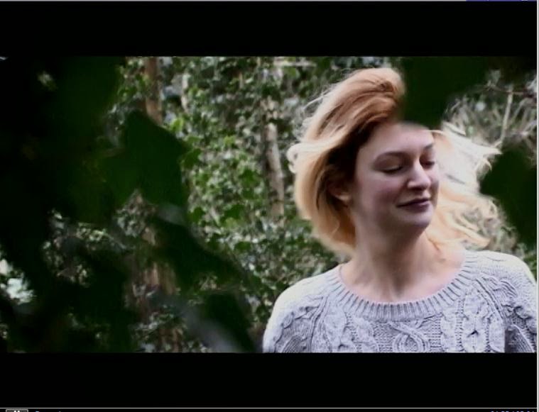
voyeuristic in a way, this is used in The Return when the viewer’s
experience Ruby’s viewpoint inside foliage spying on Chelsea fleeing from her
in the wrong direction but also when Ruby stealthily creeps up behind Jay and
snaps his neck. These subjective shots and semantic coding from Roland Barthes
Theory help engage and engross viewers into the viewing experience.
Further formulaic
conventions have been displayed in ‘The Return’ via location or locale chosen
for principal photography in the trailer. Conventional locations such as a
deeply forested woods and a haunted house were utilised in the Return following
the formulaic pattern of Slashers have to display these reoccurring locations.
Various Mise En Scene which is referential to the genre is entailed with the
locations utilised in The Return e.g. the dead leafless trees in the Ruby
pursuit scene in which they portray death or an unnatural eeriness. The
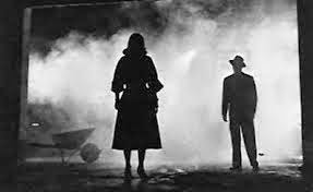
location and leafless trees also incorporate elements of film noir and German
Expressionism to express Ruby’s state of mind; A scary lifeless & fruitless
object intent on killing all of Frankie’s friends and eventually Frankie too.

When Ruby
walks down the street and leaves the swing the usage of a black and white
filter and ‘old vintage scratches’ filter demonstrate a flashback and the
non-linear narrative which subverts the common convention of slasher films to incorporate a singular or linear
narrative with no major reference to the past. By subverting this convention
‘The Return’ adds very unique element to genre which have not been done before
on a scale or extent to which the Return does so, this creates a gap in the
market for The Return to be a success e.g. Inception was a success due to the
unique elements it brought to the Action/Thriller genre. The low budget nature
of ‘The Return’ means that this unique element will aid box office success for
this film and increase much needed attention.
The
convention of the utilisation of Claude
Levi Strauss’s narrative theory of Binary Opposites has been followed in The
Return via the obvious binary opposites of Ruby and Frankie
of Good Vs Evil, but also Frankie’s
sister in comparison to Frankie herself as they are complete opposites with Amy
and Frankie being shown as opposites through the ‘two shot’ showing how their
body languages differ and their demeanour are polar opposites. Frankie’s
innocent qualities are twisted by Amy’s promiscuous and party animal behaviour.
'The Return'
also follows the auditory convention for the OST Original Soundtrack to change
and become a dynamic OST via changes and alterations in tempo, pace and beat
depending on the phase the trailer is playing e.g. near the end of the trailer
Frankie and Amy have discovered the equilibrium disruption so the beat quickens
however when Jay is about to get his neck snapped by Ruby the OST non-diegetic
music stops any sound bridges and ends abruptly when Ruby is approaching Jay
until his neck snaps. The Return uses this form of sound similarly &
conventionally to the Texas Chainsaw Massacre Trailer (2013) analysed in which
the sound stops at tension filled moments for brief nail biting intervals to
generate a more engrossing experience and general tension in the
verisimilitude.
It is also a
common convention for 'indie' films to be associated with a third party company
which provides budgetary support for the film and increases the film's
recognition via their brand identity being merged with the film's. 'The Return'
follows this norm within independent films as I chose Film4 to be in
association with 'The Return', not only does this feature at the start of the
trailer but also on the end card, this helps viewers associate Film4 with 'The
Return' which again, helps the film gain much needed recognition. The end card
also follows the convention to feature a film website, cast and crew and a
release date or if too early to release such a date then 'coming soon', this
helps the audience engage further with 'The Return' whether it be via exchange
or looking up the filmography for certain cast members, the end card develops
on the interest already gained, building on the momentum of the viewer’s
attention to generate ticket sales or box office success.
Magazine
Moving onto
the magazine, I have created what I perceive as a very conventional magazine
cover. This is due to the usual conventions of magazines being abided by as a
result to the magazine I chose; Fangoria, which although displays itself in a
formulaic way regarding the magazine industry but caters to a very 'niche'
audience of horror fans, as the magazine's name implies. For example, the main
central image of Ruby is superimposed over the masthead, a common convention
used in magazines to display and showcase the main cover article and its
importance, it also clearly displays the focus of the issue. In addition, the
fact that Ruby is quite scary I felt that following this convention of
superimposed main central image was aptly suited to her. Other ubiquitous
conventions prominent in magazines followed were locating the banner near the
bottom of the cover, utilising social media integration so readers can enjoy a
digital copy of the issue they bought promoting synergy and the internet
working together in a symbiotic relationship, clear display of barcode &
pricing etc located in the upper right and lower left of the cover unlike
Little White Lies which displays the barcode unconventionally in the middle of
the magazine.

Fangoria
also follows its own set of unique conventions exclusive to the magazine which
subvert conventions of the magazine industry; such as a convention to have
prominent gore and blood involved, integrating into each picture or main
central image. I followed this pattern by having a picture of a colleague
(which I edited on Photoshop and used latex make up to produce the effect of)
slitting her throat, a filtered and edited image of a colleague to look like an
un-dead corpse (Photoshop CS6) and of course Ruby who is making a scary 'direct
address' with the reader blood soaked and her knife dripping fresh blood. It is
conventions such as this which I felt were apt for 'the Return' to be featured
on this magazine due to a similar demographic and interlinking codes and
conventions between the media platforms/mediums e.g. Gore involved on the cover
like how Slashers require gore also.

Another exclusive convention used in Fangoria which I
followed was the decision to feature all side articles on a film roll, I
displayed three other images on the film roll to display the side articles
(Undead corpse, Pits Of Hell and Del Toro interview). This has the advantage of
giving the main central article and image space whilst still 'cramming' the
cover full of content to refer to its good value for money. The utilisation of
the film roll in my cover also demonstrates the target demographic; Horror film
fans as the name implies.
Magazines
have a convention to utilise buzzwords also, typical words used are 'WIN' or 'HOT'
as these words immediately gain attention from the reader and is hence an
effective tool to gain attention in certain regions of the magazine. My Fangoria
magazine cover utilises this convention as I displayed a 'WIN' Saw Tickets
inside!' within a blood-splat which was appropriate for the magazine
demographic that enjoy the horror genre. As a result of using this buzzword the
reader now has an incentive to continue reading.
In the
magazine cover I ensured that 'The Return' title and its typography were large enough
to identify as this maintains the brand identity used in the trailer and poster
and works with that momentum gained of recognition for the film.
Poster
Moving onto
my poster, this poster was the most formulaic product of all three ancillary
tasks. This was due to information and referential data being located were they
are usually located conventionally on posters whether
it be an indie or blockbuster poster; such as the Principle cast and crew, with
the cast and crew information located at the bottom of the poster and centred,
this serves as an immediate indicator that this poster is a promotional text
for a film and not a book, music album or video game hence why the following of
this convention was fundamental to me, the decision to have the slogan and film
title framing the main image of Ruby & Jay.
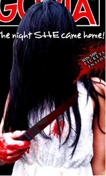
I also made an intertexual reference in the poster by having the slogan
"The night SHE came home" which is a play on the slogan of Friday The
13th's slogan, this is gratifying for my demographic to identify making them
feel 'part of a group' tight knit niche member of fans who understood the
reference.

The poster,
like many posters, makes reference to the narrative of 'The Return' as Ruby is
freshly blooded and her dress is stained which clearly allows the viewer to
identify the villain but also identify the victims (Jay). The leafless trees
act as a horror based backdrop for Ruby and when juxtaposed with the black and
white edited filter portrays the dark and grim tale 'The Return' has in store.
The usage of the black and white filter and the sharp and dark blood contrasts
very well and refer to the Slasher genre via the three colour palette chosen, this
colour scheme is consistent amongst the three ancillary tasks.
More followed conventions include the way the
production, distribution and third party companies are displayed which are
located at the bottom of the poster with an age rating, release date and sound
company. The display of the sound company clearly tells the viewer that
auditory wise the film is already high quality with Dolby Digital Surround
Sound.
My poster
demonstrates the conventional aspects of a slasher film and its genre through
the evident display of formulaic qualities which are clearly visible such as
Ruby in a white dress which has fixed meaning with the viewer as being associated
with the horror genre due to The Grudge and The Ring success. The grim and
ghastly backdrop of a lifeless forest showcases the conventional themes of the
slasher genre through the colours of red, white and black which resemble the characterising
themes of the Slasher genre; death, life and blood or rage.
In
conclusion I believe my three ancillary media products involved in this
marketing project utilised a sufficient mixture of subversion and abiding of
codes & conventions of existing media in the posters, magazine and film
industry, to attract recognition and cater to multiple demographics of
traditional Slasher fans and modern slasher fans, by doing so 'The Return'
benefits from a better chance of success as a low budget independent film.

 As described in the project brief, as part of the Research
phase an established and formidable amount of knowledge of the Slasher genre
was required prior to engaging in the planning or construction. Google.com,
Bing.com, Wikipedia & IMDB aided me in acquiring the foundation of
information on the codes and conventions of Slasher. It also allowed me to
delve into the history and influence of the genre, understanding how Film Noir
and German Expressionism are different and how they influenced the genre with their entailed unique aspects e.g. usage
of set pieces and mise en scene to express
subjective character emotion and how they still influence and impact Slasher
titles released today. The internet and its entailed sources allowed me to also
discover the formulaic and conventional factors that make up a Slasher poster,
trailer and a magazine cover; for example I discovered, via YouTube.com, that Slasher
trailers such as Dead Man's Shoes tend to start off slow paced with no
indication of genre at all which develops into a grim fast paced montage
combined with very swift jump cuts and edits.
 In the process of creating my own
production/distribution company logo I referenced and took inspirations from
many existing Production company logos such as TriStar's Unicorn which
influenced my idea to have a Grizzly Bear as the company mascot; this would not
have been possible without Google vast library of images available from their
search engine.

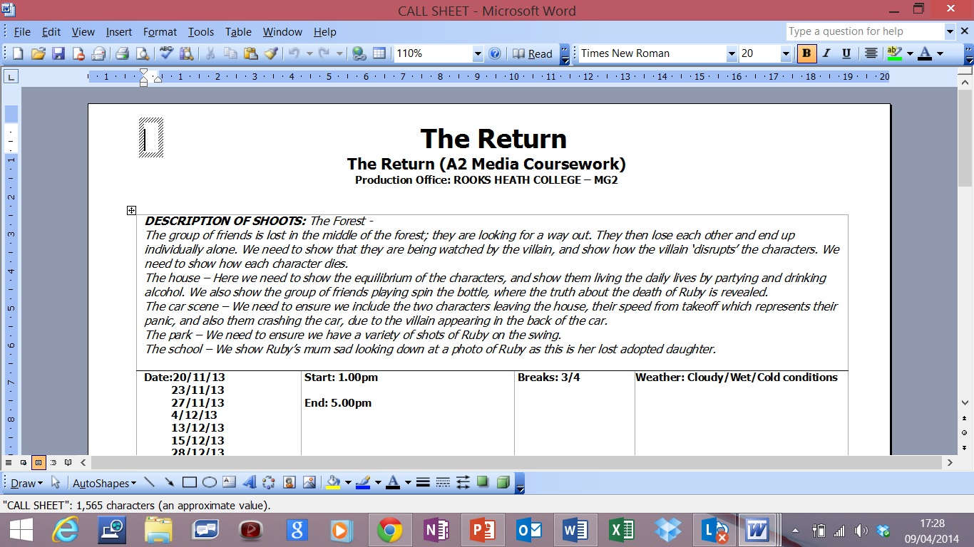
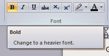 Moving on to the planning phase, Microsoft Word was utilised
very well regarding the software usage in this stage as majority of the tasks
encountered such as Risk Assessments, Call Sheets and Shooting Scripts required
a table but not to the complex and intricate extent that Microsoft Excel offers,
hence why Microsoft Word was a perfect media technology to be used for this stage
with simple and easy to read tables with customisation being simplistic and
easy with no prior experience needed to produce these, unlike Photoshop CS6.
Word allowed tables to be resized, new columns could be added and text could be
made bold. I also produced the synopsis on this document with my group as errors
and corrections could be easily modified without complication as opposed to
writing the document down on paper, Word simplified this process as the
Synopsis was particularly lengthy; providing word counts, spell checks and
structure alignment.
 However, the two products of magazine cover and poster, when
it came to the Construction phase to build the ancillary products required a
more intricate, complex and multilayered media software technology system. This
system was Photoshop CS6, initially I chose CorelDraw12 and Microsoft Publisher
to create the poster and magazine cover however I discovered that these types
of software suffered from format inconsistencies and lack of tools to utilise.
Photoshop CS6 however provided me with many intricate tools such as the
magnetic rubber or lasso which identifies the image's border and automatically
crops and erases the unnecessary background image, it also enables the user to
apply a negative, bleached, black & white and wide selection of various
other filters to be applied to images such as my Fangoria side article images;
in which I edited the model's face to have multiple negative filters with red
glowing eyes to make reference to the genre and the eerie & gore based
images located on the side of Fangoria. Photoshop
also provides the basic tools which are to be expected such as the crop, move
and resize tools which were all efficient in their own way. Photoshop has the
ability to add many layers upon a image to exaggerate an effect such as the
throat slit image in which I added 6 layers of colour defining filters which
made the blade more visible and prominent.
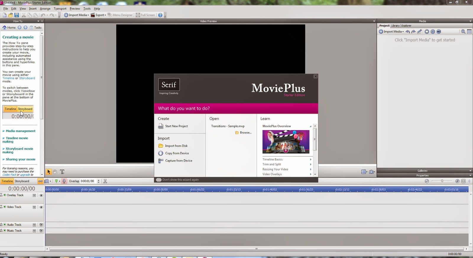


 In the evaluation phase I utilised SlideShare, a site that
allows you to upload PowerPoint presentations and view them via embedding the
URL into a blog such as Blogger.com to neatly and concisely view the research
and various other documents I created prior and post production.


